In this post, I will collect some online data science resources such as online classes, blog posts etc. that I personally find very useful. (Ratings: ⭐ useful, ⭐⭐ very well done, ⭐⭐⭐ recommend absolutely)
Coursera: IBM Data Science Professional Certificate ⭐⭐ This class is a perfect introduction for anyone entering the field. It does not assume much prior knowledge, even though some prior programming experience is helpful. Even if most of it is not completely new material, as it was for me and probably for most people, it is a great refresher: If you already know some topics, you will be quicker going through exercises and labs, e.g. you won’t lose money because of it.
Pricing: around 35€ / month.
Pros:
Very comprehensive: Covering theoretic methodology, SQL, Python tutorials, visualisation, etc.
Nicely done quizzes and labs.
The community is quite active in the forums: Your questions will be answered quickly.
The class gives an overview into the IBM data science framework around Watson studio.
Not very expensive. The more time you have, the less you spend.
Cons:
Within the class, some of the individual classes are a bit redundant.
Lecturers have varying presentational skills.
The final project for the last class (Predicting car accident severity based on a police accident report data set) was less well curated.
It does not go beyond IBM tools.
There is little information or material on how to “production-ize” a machine learning project.
Coursera: Deep Learning Specialization (deeplearning.ai) ⭐⭐⭐ This class picks up where the IBM classes stopped. Once you have mastered the foundations in machine learning such as logistic regression, you start with the more complex concepts such as neural networks. I find this class extremely well curated. This doesn’t as a surprise, since Andrew Ng, the course lecturer, is also the co-founder of coursera, so it makes sense that he is able to leverage this platform to its fullest.
Pricing: 41€/month
Pros:
Andrew Ng’s tutorial videos are great extremely well done and nice to follow.
The labs are interactive (auto correcting) and figure into your final grade. (Usually in coursera, it’s quizzes and peer-reviewed assignments)
The community support by the organizer team is very quick and comprehensive.
Cons:
The forums are a bit spammed sometimes and it is sometimes hard to find a relevant post. This is probably a general Coursera problem.
I’m currently enrolled in this class, so this verdict is not final.
The given data set consisted of a sales history of US stores in three different states in three different categories (e.g. FOOD). We did not get any information on the specific items, e.g. items were just labeled ‘FOOD-123’. Our sales data was cut at a certain moment in history and we were to predict the following weeks of sales as a probability distribution.
My role was primarily business analysis using Python Jupyter notebooks to figure out the impact of aspects of the time series such as day of the week, month-based seasonality, the impact of calendar events such as Christmas (which varied a lot depending on the representation of religions in the different states), but also the effect of food stamp distribution that varied greatly by state.
The team then used this insight to craft a multi-stage state-space model (states inactive or active) with Monte Carlo simulations to generate our predictions as negative binomial probability distributions.
Carrying out any data driven initiative for larger organisations is hard. And this is not just because tools like deep learning or any other data science-type method is complicated to do, but just getting largish (let’s say > 1 Mio. lines) data from a few source systems to your workspace system, processing it and producing meaningful results relevant to an ever-changing business strategy and all of this in production grade quality is highly non trivial.
Pipelines break easily for various reasons, starting from scheduling crashing because of daylight saving time switches to timeouts because of increased data volumes, expiring authentifications or crashing source systems. However, production grade initiatives need to be able to cope with this by having a Plan B for this sort of situation and also being able to quickly recover once the issue is resolved.
Of course the speed of recovery is key when it happens, but there are also steps that one can take in advance to smooth out these situations.
Make stakeholders aware. For non-technical stakeholders of your initiative, the different steps of the data pipeline may be far from obvious. A simple diagramme with the key steps together with a timeline can become very helpful. In a world, where the 4G mobile connection may be enough to watch movies while using public transport has made people believe that any data transfer is basically instantaneous. Putting timespans and also prices per data transfer rates can do wonders to put things into context.
Figure out key GO NOGO criteria. The one piece of technology that made NASA able to put people on the moon while having 1960s technology is a meticulous system of GO NOGO criteria and checklists making sure that each piece is properly working and for thinkable eventualities are taken care of. Depending on what exactly breaks in your pipeline, the impact might range from a slight warning to “stop using results immediately” issues to all end users. We have made quite good experience by defining for each data source the maximal allowed data age, so that criticality of the incident can be immediately assessed. When, for example, a catalog table changes only little from day to day, having a two day old catalog is usually less harmful than e.g. working on a two-week old stock table.
Having a clearly defined list of criteria determining whether the produced can be used for business decisions can make matters transparent and quick to assess for everyone including the non-technical stakeholders. Being able to flag corrupted results before further use minimizes business damage and enables trust in the process and thus in the system.
This way, users can be confident and efficient in working with these results knowing that they have a “green light” on the most critical points of potential issues.
Classify problematic cases.The list of usual suspects of situations that might break or endanger your pipeline boils down to about a dozen common cases. Having a paragraph or two reading describing the potential impact on results and business descriptions can be very handy when facing these situations. In the best case, these can be communicated to stakeholders automatically when an incident occurs or, if automation is not possible, be ready for the human noticing the issue and communicating this as quickly as possible.
Don’t panic. Last but not least, things go wrong all the time and they will probably go wrong the first time the principal data engineer is mountain climbing without cell phone reception. This is not a sign of personal failure but due to the complicated nature of orchestration. Being prepared, however, makes it less stressful.
I just stumbled upon this very interesting read on a specific type of observation bias, called Inspection Bias. Inspection bias is the phenomenon that happens when the point of view of the observer creates a bias. An example is that e.g. when you ride your bike on a track you may observe a lot of much slower riders and a lot faster riders than yourself just by the fact that due to your own speed keeping other people of the same speed at approximately the same distance.
If you are a cyclist or a runner, chances are that you use or have at least heard of Strava. Strava is a platform for athletes to analyze and share their activities’ data and virtually compete with one another.
With the rise of sports tracking devices tracing position and pacing via GPS and additionally measuring heart rate and elevation, Strava leverages this data that users upload to create a frame of reference for several types of activities. First founded in 2009, Strava has more than 10 Mio active members (in fact they emphasize not to call them users) in more than 195 countries. In 2017 alone, cyclists shared over 7.3 Bio km worth of rides.
In 2009, when they began as a typical Californian data start up, they were highly dependent on the hardware vendor Garmin: In fact, in the beginning uploading data to Strava was only possible directly from a Garmin device leaving early Strava at the mercy of Garmin. Today, the power dynamics have changed a lot: It is now Strava-compatibility that drives hardware sales. Automatic data synchronisation to Strava or even live Strava powered analytics during an activity enable not only Garmin but also their competitors like Polar and Wahoo to sell their newest generations of devices.
How do they make money
Strava’s main sources of revenue is first of all their premium membership options (59,99€ a year or 7,99€ a month).
Secondly, industry partners can sponsor challenges, that is specific goals on a specific time frame, Strava members can commit to to motivate themselves. One example is the Rapha 500 Challenge [1] of the bike vendor Rapha challenging its participants to ride 500km between Christmas Eve and New Year’s Eve.
As Big Data company, the selling of data to third party is also part of Strava’s business. For now, they are committed to share data only in an aggregated and therefore anonymized form with partners that are aligned with Strava’s vision of enabling and helping athletes. Notably, the project Strava Metro [2] aims to partner with city planners around the globe to make e.g. bike paths and most frequent bike tracks safer. On their website, you can find a case study of the partnership with the Seattle Department of Transportation.
By 2018, Strava has yet to become profitable.
My personal use cases
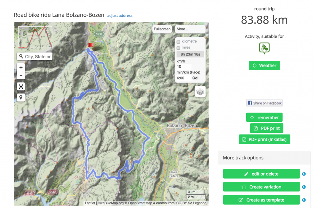
To navigate on my bike following pre-planned tracks, I bought a Garmin Edge 800 a few years ago. For this, I create a GPX, short for GPS exchange format, file of my route and upload it onto my Garmin device.
GPX track covering both the Gampen Pass and Mendel Pass in italy planned on GPSies
GPX is an XML schema which can be used to track GPS based waypoints and routes together with timestamps. In this format, one can both store pre-planned routes which can be later used for navigation as well as recording timestamps when passing these waypoints on a bike ride or a run. I use my Garmin both for navigation as well as recording, but any smartphone can do the trick as well (within its battery limitations).
When I ride, I have my track as a purple line embedded into a map [3] that I can follow to pick the right turns. After my ride, I use Garmin’s own software Garmin Express to read out the recorded GPS/time data as well as my heart rate. It is automatically transferred to the Garmin platform Garmin Connect. Garmin connect offers similar features as Strava while being restricted to its own devices. In my opinion, their dashboard composition used to be a bit messy. The new modern look has improved matters quite a lot, however this was too late and many users like myself went to look for alternatives.
Garmin exposes data of newly created activities to Strava via an API, automatically uploading any rides making them visible to my community of friends and acquaintances. Over there, I get an instant analysis of my ride: How I performed on pre-defined segments during my ride: Did I hit a personal best? Have I been able to score top 10 for women? How do I rank compared to my friends that have done this particular segment as well? Subsequently, my activity becomes visible to my friends (or to the world if I chose so).
Activity on Strava
From a data analysis perspective, Strava does a few things well from which the pro data analysis world could benefit as well.
Easy and powerful visualizations and tracking tools geared for its user base yield a powerful Business Intelligence
One of the main challenges for most amateur athletes is to keep up motivation to continue with one’s sport. On the one hand, it’s the community part that allows sharing your passion, but as well your challenges with your friends in real life like your bike club or with other like minded people that you know only online.
On the other hand, you can follow your own progress and try to beat your past self. I particularly like the feature of tracking the number of weekly activities, the overall length and elevation gain to motivate myself to keep up my rides and training.
Strava, of course, benefits from the fact that their are a lot of canonical KPIs for sports activities such as distance covered, speed, heart rate, elevation gain etc. that quite easily open the door to make a sports tracking platform’s insights relevant and meaningful for the user.
Neatly visualizing this data adapted to the needs of the particular type of sport is on the other hand much more difficult. In my opinion, Strava’s success is mainly due to its strength there outperforming Garmin with a little-cluttered interface and visuals.
Well incentivized community dynamics keep the platform and its data relevant
The heart of Strava’s data analysis capabilities are segments. Segments are short tracks of variable length between two points which cover a part of a road or a route. A typical example would be the start of a slope of a mountain to its highest point. Users can create segments themselves, but also flag segments as duplicates or irrelevant (sprints of only a couple of meters).
Even though Strava has recently invested in getting rid of most obvious duplicates in segments, it mostly relies on the communities to do their own clean ups: A lot of Strava members develop quite some enthusiasm to curate the most relevant segments that appear on their routes in order to track and showcase their performances.
The same is true for fraudulent data: If you track your “performance” on an e-Bike or a motorcycle in order to score a good ranking on an at least moderately frequented segment, you can be sure that other Top 10-candidates will be quick to report the activity to get a “fair” ranking.
This principle of community police as curator allows to avoid one of the most common threats of any Big Data endeavour, namely the loss of meaning of data due to spam and irrelevance.
Gather your stars as marketers
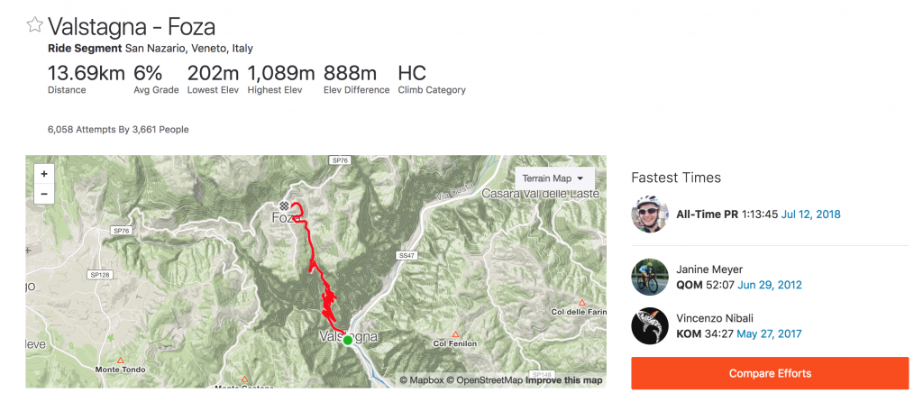
On the one hand, some KOMs and QOMs, short for King of the mountain and Queen of the mountain denoting the respective leader on a segment, are pretty much completely out of reach if a major competition has traversed one’s territory, it is invariably cool that one can also follow people like Romain Bardet (who is competing in the Tour de France at the moment) and see how they perform on your favourite segment.
Below is a screenshot of a segment that I just rode. – A segment that has been part of this year’s edition of the Giro d’Italia race allowing to compare world class cyclists Romain Bardet and Vicenzo Nibali.
Having the industry stars on ones platform is a great marketing coup to showcase ones functionalities and gives professional athletes a platform to interact with their fans.
A thought-through Premium membership principle
Currently, I use the free membership option of Strava. The premium option would allow me to get more detailed analysis such as power meter analysis, live feedback and personalized coaching to reach more customized goals.
One fun example of what could be gained from a premium membership is the possibility to get live segment information during my ride: I would see exactly how I’d need to perform to score a good ranking on say my favorite hill. Strava’s philosophy is that most people will sign up for the free option and quite steadily go for the premium option once they have been with Strava for a while.
And even while you are not paying, you are still contributing to the richness of data accumulated and curated in Strava. While Strava has yet to reach profitability, this balance seems to be quite powerful for Strava to generate value to both members and partners.
The big key word for the future of Strava is ‘Discovery’: Assume you travel to a new city and you want to go for a run. Strava knows your typical distance and whether you like hilly terrain or flats and can recommend you routes that other athletes just like you do in this particular city. To which extent this will be part of the premium part of Strava, is not yet clear, but to me, these kinds of recommendations would be very valuable and something, I would definitely consider paying for.
Grow with challenges
As a data company/social media platform, you are under constant public scrutiny. In the beginning of the year, a story broke of a secret US military air base [5] being exposed on a Strava heat map: Soldiers had been recording their training as ‘public’ on Strava. Even though the data was anonymized, having a well-frequented running course in an Afghanistan desert left not much room for speculation.
Even though one can clearly argue that this incident was largely due to the carelessness of the people uploading their data publicly without second thought, this still is a challenge for a community to educate its members on the consequences of privacy. This holds both for Strava itself, but also for mainstream journalism who mistakenly called this a ‘data leak’ or ‘data breach’ which it most definitely wasn’t.
Strava itself took action to highlight in detail the opting out possibilities in order to avoid these including the introduction of a minimum numbers of activities for a path to show up on any heat map. Furthermore, heat maps are refreshed regularly so that activities that are later made private no longer show up. This means that even if a group of soldiers mistakenly uploads an activity of a secret location, they can still take action to have it be hidden and further damage can be avoided.
Another ongoing discussion that concerns a far greater base of users is the possibility to opt out of certain aspects of data sharing. Unfortunately, many athletes, in particular women, are not comfortable sharing timed location data of their runs publicly, since it could be very easy for stalkers or even attackers to guess patterns and pose a serious threat. For now, the only option is to not share an activity at all publicly. Strava has said that they currently explore of how to make only parts of an activity publicly visible while still integrating the other relevant parts of the activity.
Notes
[1] Rapha 500 Challenge, see e.g. the 2016 version here:https://www.strava.com/challenges/rapha-festive500-2016
[3] For planning, I use www.gpsies.com. Strava offers its own planning tool, Strava routes https://www.strava.com/routes. Out of say a bit arbitrary historic reasons, this tool however has not yet gained much traction in my friend cycle after the tool recommended to one of our more passionate road cyclist to use a less than optimal gravel path for his precious road bike.
[4] Open Street Map https://www.openstreetmap.org/ is an open source mapping database permitting to download any map selection in Garmin-compatible formats
[5] BBC article on the Strava Military Base incident from 28/01/2018 https://www.bbc.com/news/technology-42853072
In this series of blog posts I explore the different type of biases that I come across as supply chain scientist. While my particular examples usually tend to come from the supply chain and eCommerce world, the biases described are quite general.
Bias #2: Selection Bias
Another tricky bias to deal with is selection bias. Selection bias is the systematic under- or over representation of data sources. Think of a polling agency trying to predict the outcomes of an upcoming election. In order to do so, they need to sample people’s opinion. So, assume next Sunday are the election and on this Wednesday at 11:30 they go their own city’s central market place and start asking people who they would vote for. It turns out, people happening to be on a market place at 11:30 on a week day might actually not be correctly representing the general population and hence a sampling like this will not yield to trustworthy results.
In the era of Tech data analysis one might think ‘great, now with our fancy Big Data technology we no longer have to rely on unrepresentative samples, we can just process all the data there is – voilà no more selection bias‘. And in a perfect world with only clean data, this would be true. However, in the real world with real processes or humans creating your data feed, systematic corruption of parts of your data might again cause selection type bias.
Usually, with the growth of a business, the number of input data sources grows as well. For example, if you think of a commerce, the number of sales channels increases (phone, their own web shop, Amazon market place etc). All these different data sources for sales do not necessarily capture data in the same way and the same level of completeness e.g. for some edge cases one sales channel may be bad at recording, while others may do it correctly. Over time, these differences may accumulate and if you look at the results as a whole, skew your perception in one direction or the other.
One other very common source for this type of bias is when you replace one data source tracking system (i.e. the ERP tool) with another one. This yields to one legacy system coexisting with a new one with potentially completely different philosophy, use cases and configuration. Defining a proper data mapping between these systems can be a quite complex task. Avoiding introducing systematic errors from one to the other is quite delicate.
How to deal with selection bias
The problem with selection bias is that you will not be able to tell it from only looking at the data you have. So, there is no fancy high tech statistical Data Science method to conquer this bias.
The way to deal with selection bias is to carefully study the underlying business processes to first understand potential sources of selection bias and then find proper business indicators to check for these.
Part one involves a proper business analysis along side with an analysis of the data architecture supporting it. In my own work, I usually try to draw a diagram of the flow of goods from conception to delivery to the customer and if applicable, the return processes and a second diagram of the flow of data for each of the steps of the diagram of the flow of goods.
For each of the “arrows” of such a diagram (i.e. from production/manufacturing to storage, from storage to delivery etc), i.e. each cross section of a physical system to another and each interface between data systems, data may be lost, skewed, delayed or counted multiple times. From business one needs to get the appropriate real life statistics of what is supposed to happen between these systems such as how many items have been send from suppliers to the central warehouse each day, how much sales volume has been generated from each channel on any given day etc. Then you can compare the measured values with the figured coming from business to spot gaps.
This requires a quite extensive knowledge and accounting and documentation of the business and the data architecture. In the long run, the effort spend on this will lead a high return on investment.
One major challenge we face as supply chain scientists is bias in data. In this series of blog post, I would like to describe a few of the major biases that we see, why they are harmful for any prediction or sales analysis and how to deal with them.
While I write from my perspective as supply chain scientists, this analysis applies to basically anyone who is doing any sorts of data analysis or research on data.
Bias #1: Confounding variables
In a nutshell, at Lokad, we use past sales data to make predictions on future demand. At first glance, this sounds perfectly reasonable – you measure past demand to predict future demand – so where’s the bias?
In fact, there is quite a range of other variables, that would make meaningful predictions hard to impossible. The term ‘confounding variable’ refers to any sorts of influences that impact the cause-and-effect relationship that you would like to study which are outside of your current considerations.
Let’s assume you are studying the following sales history:
Day
Nb. of Sales
Monday
8
Tuesday
11
Wednesday
9
Thursday
2
Friday
15
Saturday
15
Sunday
12
So what happened on on Thursday? Maybe mid-week is just the slow period for you? It could, however also be that there are some confounding variables at play.
One basic question one should start with is the following: Were clients able to buy all the time or was there some obstacle preventing sales?
One such factor could be website downtime if you are, for example, an eCommerce. In our example above, maybe, the webshop was down from Wednesday night to Thursday night. This is very valuable information to store. There might also be some “soft downtimes” if, for example, there was a small bug in the shop software preventing one product category to be shown properly at it’s usual place.
Even with a functioning web shop, you cannot sell what you do not have (except in the cases where one allows backorders). Stockouts represent one of the major form of confounding variables we encounter frequently. Low observed demand might just be caused by low stock or stock outs of a top selling product. In some businesses, stock levels are visible to clients either in a reduced way if there is little stock to indicate urgency to the client (“Only two articles in size 40 left”) or sometimes fully (“300 pieces in available”) to demonstrate stock health to potential big customers. The latter is known as a facing quantity.
Without understanding the relationship between stock levels and sales, demand can be critically underestimated: In our example, we may have encountered a stockout on Wednesday evening. Thursday morning, we might have inbounded two returns that were sold right away before we received a replenishment before business started on Friday. (In real life, this usually drags out a bit longer and you might see a longer period of low sales days depending on your replenishment cycle length) Note that keeping the stock out history would probably not have caught this issue in the example, since at some point two pieces were in stock on Thursday, but clients were not completely able to buy freely, since the quota of the day was capped by the two pieces in stock.
In general, keeping a history of stock levels or at least a history of stock outs per product is generally very much advised.
Another confounding bias may be evolution of prices. Depending on your vertical, your clients may be more or less sensitive to price changes and therefore knowing the sell price of each sale might give you important context of the demand. In our example above, the product might have been discounted for all week days apart from Thursday.
Unfortunately, this only gives you the demand at the price you had for a certain day. It is not possible to “replay” the demand at a given day at another price to study what would have happened if you had discounted or up-priced more. Here, a more dedicated price elasticity study would be necessary. On the other hand, knowing for each sale the price allows to establish a certain baseline around the main prices classes (such as e.g. original price, -20%, -30%) so that you can understand which periods in history were associated with an inflated demand due to discounts, or deflated demand due to surges.
How to cope with confounding bias
Well, the most ideal course of action is to try and study all possible confounding variables and make them part of your consideration so they can become genuine variables of your analysis.
To be able to do so, understanding how the business works is crucial. The key take away for me for confounding bias is that looking at the data alone is not enough, it is analyzing the business together with the data that makes any data investigation meaningful leading to usable results for business.
In some cases, this might mean to start tracking or snapshotting some extra data (downtimes, stock levels, etc), which usually means a little extra effort and some more storage consumption, but this can pay out quite well.
The set of problems that arise if one’s online profile is incorrect, resulting in unsuitable online advertising and ratings which may limit your access to information and services regulated by these ratings and clustering based on one’s profile.
In his latest novel (1), the German cabaret artist Marc-Uwe Kling envisions an absurdist post-modern future in a country that for marketing reason chose to rename itself “Qualityland” and of which (also for marketing reasons) all inhabitants must only use superlatives when speaking about it.
The protagonist, Peter Arbeitsloser (Peter Unemployed – to increase transparency, children in Qualityland take their parents’ job title at the time of birth as surname), suffers from a particular problem: The major online actors, TheShop – The world’s most popular online retailer -, which sends you products you will like based on your profile, the social media platform Everybody – everybody is on Everybody! and as well as QualityPartner – the dating service that chooses your partner for you-, have gotten it wrong: Peter receives things he has no use for, he is made to hang out with people he does not like and is dating someone he cannot stand. All of it is due to the fact that people have completely surrendered to the suggestions and recommendations of the underlying algorithms making it virtually impossible to consciously make one’s own choices.
Now Peter has been misclassified by all of these platforms. The most obvious consequences like the TheShop sending him highly inappropriate dolphin-shaped items seem like nothing more than a nuisance at first glance. Much more problematic though is the fact that Qualityland’s society has decided to also completely rely on one’s online profile for any sort of aptitude tests, such as recruiting or any sort of social stance. Much like Black Mirror’s episode Nosedive, one’s profile is condensed into a personal score which functions as a shortcut to one’s worth in society.
Peter, at some point, drops down to a 9 out of a 100 and is therefore part of the “useless” category of society, banning him from most of the daily life. (For real life examples of this see (4))
So, what does Peter’s tale wants us to do? To stop using our favorite online services is hardly an option. But to take ownership of our profiles and to what purpose it is used might be worthwhile.
The twist however is where this highly amusing piece of fiction comes to its limits: Having Peter’s problem becomes less and less likely. Already today, having access to someone’s “likes” on social media makes algorithms far more capable of judging one’s personality than ones acquaintances, friends and family. (2)
While the current mood tends to go to more transparency toward what our data is used for, it must still be clear, that once we create data points in public, conclusions can be drawn from that. This includes also not quite voluntarily produced data aka data collection of which we cannot opt out easily, such as face recognition in public – see again (4))
It is the far greater challenge for us to decide, what we, both as citizens and consumers, would like to do with this data and how we would like to steer our ownership of it.
As organizations collecting these personal profiles, the need for a transparent usage policy of these profiles, that is a
clearly defined data model/structure,
an explicit formulation of intent of usage visible to the user,
and a defined data life cycle from collection to an option of deletion (e.g. flow chart style)
becomes, in my opinion, more and more important. First, because of legal reasons (5), and secondly, to continue to provide any “data driven” added value of quality (pun intended) based on correct and consciously given data.
(2) Private traits and attributes are predictable from digital records of human behavior. Michal Kosinski, David Stillwell, and Thore Graepel. PNAS April 9, 2013. 110 (15) 5802-5805; https://doi.org/10.1073/pnas.1218772110
(3) If you’re interested in what kind of conclusions Google and co have drawn from your online behavior, check out the following links:
Am 12. Juni 2018 bin ich auf Kurzbesuch in meiner Uni, an der TU Darmstadt und halte einen Vortrag im Seminar ‘Heute Mathe Morgen ?’ und spreche über meine in Paris ansässige Firma Lokad:
12.06.18 — 13:30 Uhr in S2|15 51
Wer Interesse hat mehr zu erfahren über:
Deep Learning / Machine Learning in der Industrie,
Quantitative Logistik Optimierung,
was endliche l_1-Folgen mit Logistik zu tun haben,
Disclaimer: In this post I’m going to write about how we use Deep Learning in my company, Lokad.
When you follow the news about deep learning, you might have come across exciting breakthroughs such as algorithms which are able to colorize black and white photographs or automatic real-life translations of texts on pictures taken by a phone app. While these are all pretty cool applications, they do not immediately give any direct use cases for most traditional businesses. At Lokad, our goal is to translate the stunning reach of deep learning capabilities into the real world, to optimize supply chains everywhere.
So, before going into detail how we do that, let me quickly and very roughly summarize what Deep Learning actually entails without going too much into technical details.
First of all, deep learning is a flavor of machine learning. Regular non-machine learning algorithms require full prior knowledge on the task (and no training data whatsoever). An expert-knowledge approach to demand forecasting would require you to specify in advance all specific rules and patterns such as
“All articles that have category=Spring will peak in May and slowly die down until October.”
This, however may only be true for some products of this category. It is also possible that there might be subcategories that behave a bit differently and so on. Combining these with a moving average forecast already yields an overall understanding of future demand which is not so far from reality.
However it does have the following downsides:
It does not embrace uncertainty — In our experience, risk and uncertainty are crucial for supply chains, since it’s mostly the boundary cases that can be either very profitable or very costly if ignored,
You have to maintain and manage the complexity of your rule set – An approach is only as powerful as the set of rules that are applied to it. Maintaining rules is very costly i.e. for each rule in the algorithm, we calculate there is an initial cost of about 1 man-day of implementation, testing and proper documentation initially and about half a day of maintenance. Assuming you keep on refining your rules and therefore have to readjust the old ones this yields a cost of 8k € per rule for a five year period. It is worth noting that this only applies for one rule and does not take into account the exponential increase in complexity that arises when dealing with more complex product portfolios. Even demand patterns for small businesses usually exhibit dozens of influences making their maintenance incredibly costly.
Now imagine that there is a technology that could, like a human child, learn on its own to deduce patterns from data and could thus independently predict how your portfolio of products develop throughout a year.
Just like a child in development, a deep learning algorithm will try to make sense of the world by trying to deduce correlations from observations. It will test them and discard those that do not make any sense for the remaining data.
Again following our analogy, like a child learning to makes sense of the world, a deep learning algorithm is consuming lots and lots of data and the key lies in grasping the information that is actually relevant. While a child in a big city might be completely overwhelmed with all the different colors, noises and smells, it will learn later that the traffic lights are the ones to watch out for in combination with noises coming from approaching cars that are most critical when crossing a street. The same mechanism is in place for deep learning. The algorithm may process a vast amount of data and needs to find out the essence of what drives demand.
The way to figure out what is important and what is not is carried out via repeating similar situations several times, like you would repeat correct traffic behavior with a child. A human brain is highly parallelizing its sensory input processing and reaction, so that it is able to react quickly to urgent new data such as a car that is approaching while crossing the street.
With the rise of big data, parallelization became also a key topic driving efficiency and, in fact, feasibility of a “human-like” autonomous learning process.
At Lokad, we actually use the parallelized computing power high end gaming graphic cards in our cloud servers, to efficiently run our optimization for our clients, processing for a portfolio of 10.000 products with five years of sales data in less half an hour while largely outperforming any conventional moving average based algorithms (or even Lokad’s own earlier generation machine learning forecasts) in accuracy.
Lokad then uses the demand forecasting results which come in a probabilistic format to optimize the supply chain decisions taking into account economic drivers such as one’s stance on growth vs. profitability. With these analyses, Lokad directly delivers the best supply chain decisions such as purchase orders or dispatching decisions. “Best” here refers to the economic driver set up (i.e. growth vs. profitability, opportunity costs etc.) that has been put in place supply chain decisions. It it will scale with the business as one’s portfolio and demand patterns become more complex making any hard coded demand forecasting rules which need to be maintained by a human completely obsolete.
Notes:
Average Developer salary in Germany 58k €, 261 working days – 30 days of vacation in 2018 yields a 250€ manday rate)